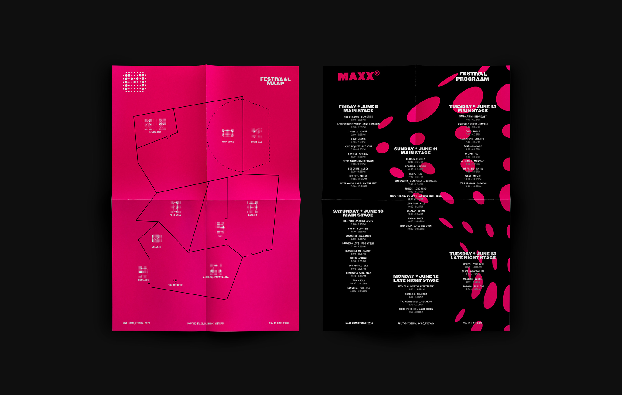
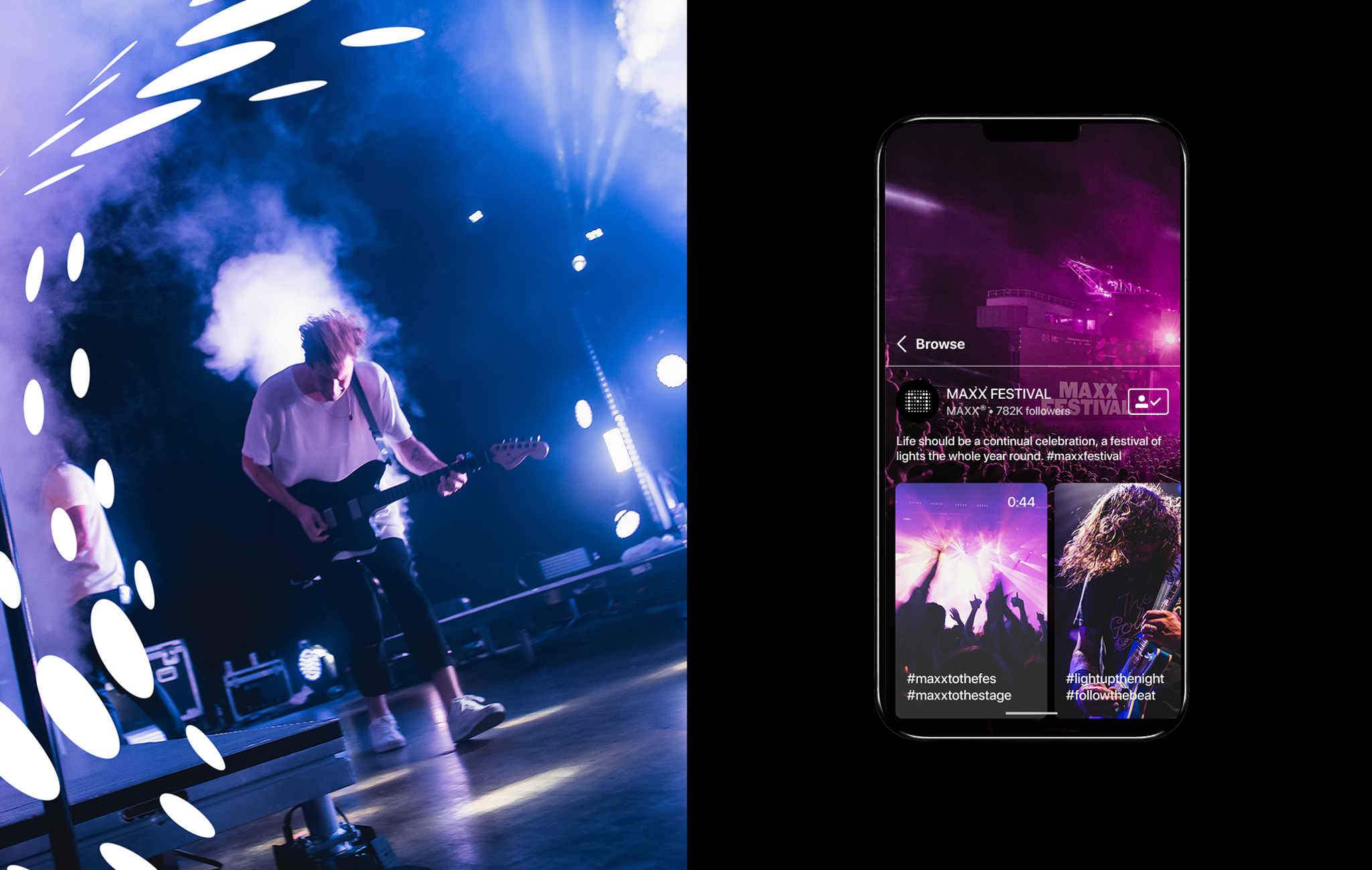
The concept is about a music festival organized and sponsored by leading audio technology brands. MAXX symbolizes the ability to amplify all emotions.
MAXX is a wordplay of ‘Maximize’, therefore, the logo in form of letter M inside an amplified circle represents the propagation of sound waves. The idea of ‘maximizing’ the logo into many different forms became the dynamic visual system of the brand identity. The circular shapes are simple yet could be transformed into several complicated and interesting versions, which support both graphics and photography. The doubled-letter used in some words manifests even more the ‘maximize’ idea and draws the attention of audiences.
The logotype and typography system as well as the extremely powerful color palette combined with the dynamic graphic system from the logo with the explosive and explosive symbolism, gave this event a very modern identity and left a long lasting impression.
Creative / Art / Key Design by me. Showcase Thien Phuc at REFORMN. Animation by Cuong Tran.